L’encant
L’encant is a coffe – sushi – bar – take away in Granollers center that commissioned us her visual identity and applications.
Client: L’encant, cafè-sushi bar-take away
Year: 2011
In front of a target audience very wide the goal is to reach to everyone with a fresh, diverse and quality offer at economic prices. We raise an image that brings us closer to the sushi world without forget the local product.
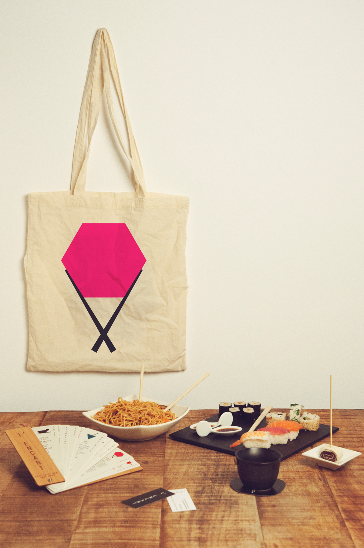
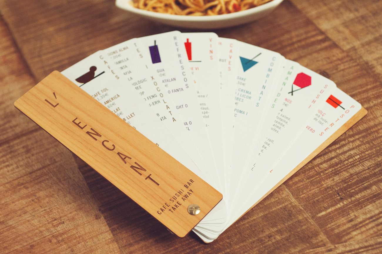
For this we focused in two elements that brings us closer to the asian culture and the mediterranian like the sticks: the toothpick and the chopsticks. The apostrophe, the vertical typography and the menu card opening as a fan are elements that connect to the Asian world.


With this tww ideas we designed a graphic sistem based on the apostrophe, the stick and the van.

To work with sustainability criteria we built the menu with a resistant material for the daily use: we designed it with stone paper: they are totally waterproof, resistant and very difficult to break.
Stone paper is made of reusable materials, which can be recycled and minimize the energetic cost and the waste of resources, with no need to cut trees down because it’s made without cellulose (cradle to cradle).

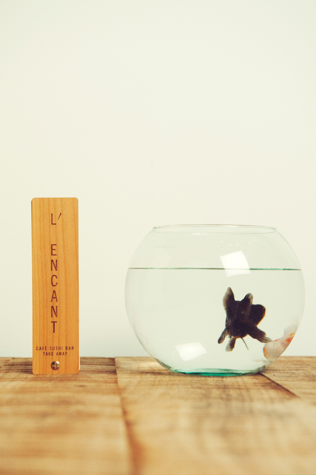
We choose wood covers because, in addition to transport us to oriental world, they are elegant and recyclable. Once the menu has to be replaced, its easy to recycle and repair, since all the materials used are connected by a metal screw.


